Table of Contents
Today I published a new version of Akurai theme, version 1.0.6. There aren't many changes this time, but there's one that's very important and I wanted to write about it.
The main changes include adding the options to load terms and conditions via AJAX request (both on click and on hover) to the theme sidebar widgets, and they work the same way as for the tables and grids. Read more about that here. I've add the same feature to the Review List block as well.
Accessibility
The important part about this update is accessibility improvements, with this update the theme should be 100% accessible. This will help users with vision impairments to navigate your websites easily. All the shortcodes, blocks navigations are improved to comply with the Web Content Accessibility Guidelines.
This also enables users to navigate the websites using just their keyboards. I myself heavily rely on keyboard navigation and use the mouse/trackpad only when I have to, and it's frustrating when I visit websites that do not allow me that, so your websites won't be frustrating your users now.
My idea for publishing these themes and plugins was to try to make it as easy as possible for webmasters like you to use them and create compelling websites, to provide functionalities without compensating their ease of use. I'm trying to stick to this idea, and therefore making accessible websites is a top priority for me.
Element Outlines
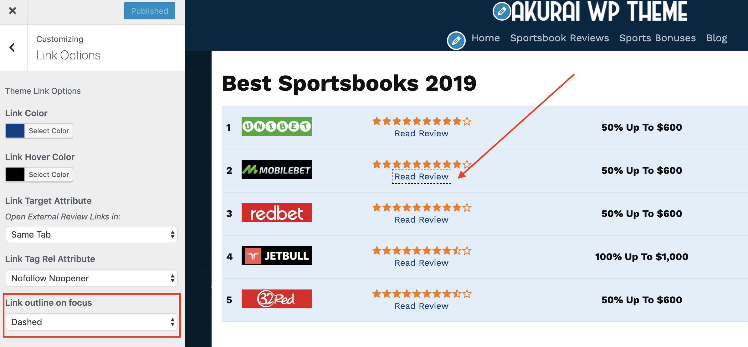
That being said, there's one thing you need to do to assist your users. By default when you focus on a hyperlink or a button on your website, it has no visual effect, so you can't tell whether it is active or not. Now there's a new option in Customizer -> Link Options called Link outline on focus and it has 4 options: None, Dotted, Dashed, Solid.

As it was not present in the theme before, I had to set it to None by default in order not to cause any issues on your websites. However, I strongly encourage you to set it to one of the three options which will highlight the element when focused/active with an outline of your Link Hover Color. Please change it.
ℹ️ Heads-up! After the next update, I'll make it by default set to dotted.
Contrast Ratio
Another thing that you need to consider is the selection of colors. When your background is dark your text color must be light enough to be visible or when the background is light, the text color must be dark enough to be visible, to keep the contrast ratio. It's important to have enough contrast between colors to make it easy to read the contents and notice links, etc. Please pay attention to that when choosing colors for your website.
Testing

Also I wanted to share with you some Lighthouse audits results I ran today. Don't pay attention to SEO score, as it's low because the demo website is closed for indexing.
Yours is open, go ahead and create a website with top 100 scores!
Let me know if you think something is missing or there are any issues. I'd be more than happy to check them out ✌️

Written by Levon, Founder of DinoMatic
Hey, I'm Levon — a web developer who loves helping gambling and Forex affiliates build fast, SEO-friendly websites that convert. I've created WP themes like Spinoko, Akurai, and FXT, designed for lean setups that don't compromise on performance or rankings. I write from hands-on experience — I test, tweak, and share what works.